Restaurant Dashboard for Delivery Operators
Summary Highlights
See sales, store uptime, reviews, promotions, disputes, and payouts in one restaurant dashboard. Find delivery issues faster and book a Voosh demo today.
If you run delivery across more than one channel, you probably already have “a dashboard.” The problem is that it usually lives in six tabs, three emails, two marketplace portals, and one group chat.
That setup breaks fast.
Off-premises is now a core operating lane, not a side project. National Restaurant Association trend coverage says 75% of restaurant traffic is takeout, including drive-thru and pickup, and 95% of consumers say speed matters. When that much demand sits outside the dining room, operators need one place to see what is happening and what needs attention first.
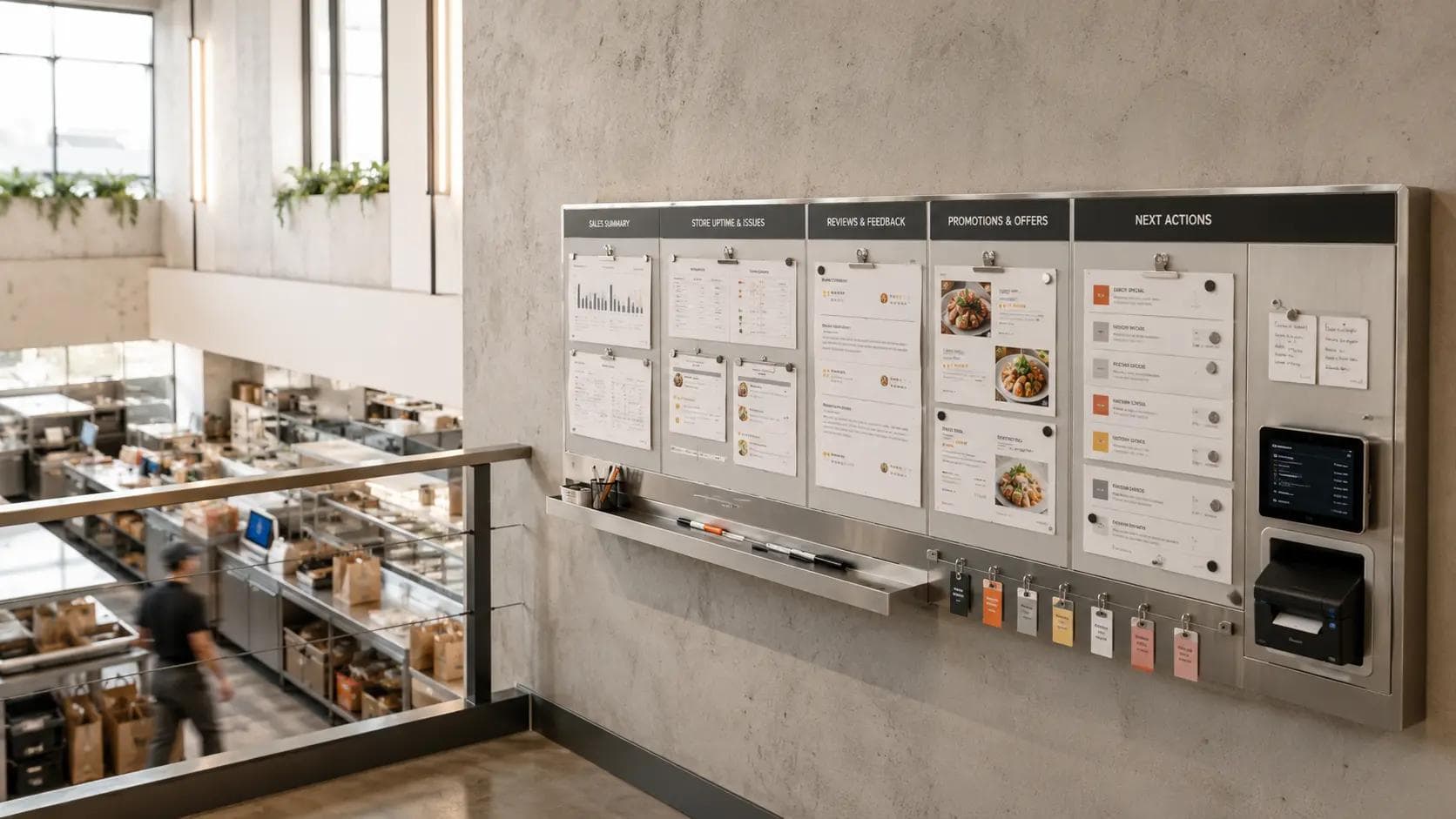
A restaurant dashboard is a single operating view that shows what matters right now across sales, store uptime, reviews, promotions, and task alerts. For delivery operators, the best dashboard does more than report numbers. It shows where revenue is leaking, who owns the fix, and what needs action first.
Most restaurants do not have a data problem. They have a visibility problem.
You can pull sales from one place, reviews from another, and downtime alerts from somewhere else. But if your GM has to stitch all that together by hand, the dashboard is not helping. It is homework.
That matters even more now because review volume and review integrity both matter. Yelp said last month that it has more than 330 million local-business reviews and is leaning harder into AI to help users scan and interpret them. At the same time, the FTC’s fake-review ban is now in force and Google has tightened enforcement against suspicious review behavior. In plain English: operators need a clean, compliant system for visibility and recovery, not hacks.
Why most restaurant dashboards fail in the real world
The usual dashboard mistake is simple: it stops at reporting.
It tells you revenue was down yesterday. Good to know. But why?
Was one store offline for 42 minutes? Did low-star reviews spike after 8 p.m.? Did a promo pull in low-quality volume? Did dinner orders disappear on one marketplace while lunch held steady on another?
A useful restaurant dashboard answers those questions without making your team go on a scavenger hunt.
That is the real shift. A dashboard for delivery operators should not just summarize the past. It should help your team make the next decision faster.
The five tiles every delivery dashboard needs
See sales by store, channel, and daypart
Start with the obvious one, but do not stop at topline revenue.
You need to see sales by store, by marketplace, and by daypart, because delivery problems usually hide in the cuts. A brand can look fine at the weekly total level while dinner on one marketplace is falling apart in five stores. VooshGPT is built around exactly this kind of question-answering workflow. Its public product page says it reads sales, downtime, reviews, disputes, payouts, and promotions across marketplaces and can explain what changed, why it happened, and what to do next.
The practical question is not, “How much did we sell yesterday?” It is, “Which stores lost dinner sales, on which channel, and what changed?”
That one shift turns a backward-looking chart into an operating tool.
Catch store uptime issues before they cost orders
If your store goes dark on a marketplace, the customer does not care whether it was a menu sync issue, an outage, or a manual pause. They just order from someone else.
This is why uptime deserves its own tile, not a buried line in a report. Voosh success stories show what this looks like at scale. In one 200+ location QSR case, Voosh publicly reports 34,604 auto-switch-ons, 3,440 potential downtime hours saved, and $241,046 in potential sales protected in 60 days. In another 40-location case, Voosh reports 2,346 auto-reopens, 142 hours and 23 minutes of downtime saved, and $15.3K in revenue protected in 30 days.
Your dashboard should show three things here:
- which stores are offline right now,
- which stores have gone suspiciously quiet,
- and how much of the day’s revenue is at risk if nothing changes.
This is the tile that keeps “we had no idea” from showing up in ops review.
Keep reviews and response backlog from piling up
Delivery reviews are not just a brand metric. They are a service-recovery queue in public.
If a dashboard treats reviews like a monthly marketing report, it is too slow. Operators need to see new low-star reviews, unanswered reviews, rising issue categories, and location-level drift before that feedback becomes a pattern.
Voosh’s public review-management stories make the point clearly. One 60-location fast-casual brand replied to 7,500+ delivery reviews in 90 days, kept median low-rating response time under 30 minutes, and sent 1,300+ capped win-back offers. Another 14-location brand got unanswered reviews to zero and lifted its average rating to 4.71 over 30 days.
This is why your dashboard should show more than stars. It should show:
- low-rating backlog,
- response-time trend,
- top recurring complaint themes,
- and which stores are drifting from brand standards.
That is how reviews become operational input instead of digital clutter.
Track promotions without losing margin discipline
Promotions look great when you only measure orders.
They look very different when you measure whether they pulled the right customers, lifted the right stores, and held up after the discount.
A restaurant dashboard should show promo performance by store, channel, and time slot. It should tell you which offers are lifting volume, which are just buying weak traffic, and which stores should not be running the same offer at all.
Voosh’s public promotions case study for a seven-unit bagel brand is the kind of proof this article should lean on. The company says the brand lifted sales 13% in three months, added $13K in monthly payout value, and improved AOV while using clearer marketplace roles, tighter store-level budgets, and targeted offers.
That is the difference between a dashboard that tracks spend and a dashboard that helps operators stop wasting it.
Turn alerts into an action queue your team will actually use
This is the tile most dashboards miss.
If an operator sees a problem but still has to figure out the owner, the urgency, and the next step, the dashboard is unfinished.
The last tile should be an action queue. Not noise. Not “FYI” alerts. A real queue.
A good queue shows the issue, the store, the likely reason, the business impact, and the owner. VooshGPT’s product page says it is designed to give the next move instantly, including opening the exact time range, downloading the report, alerting managers, enabling automations, and helping teams keep stores live.
That is what operators need: fewer charts, more next moves.
How to build a restaurant dashboard in six practical steps
You do not need a six-month BI project to do this well. You need a workflow.
1. Pick one source of truth. Decide where marketplace sales, uptime, reviews, and promo data will be read together.
2. Set red and yellow thresholds. A dashboard is only useful if the team knows what counts as “fine,” “watch,” and “fix now.”
3. Build both roll-up and drill-down views. Leadership needs chain-level patterns. Store leaders need location-level detail.
4. Add owners to alerts. Every critical signal should have a human name next to it.
5. Run a 10-minute daily check. Focus on overnight review risk, current downtime, and daypart sales gaps.
6. Use the weekly review for root causes. The daily review catches fires. The weekly review stops repeat fires.
The best dashboards feel boring in the right way. Teams know where to look, what matters, and what happens next.
What changes for independent operators and multi-unit teams
The dashboard does not need to look identical for everyone.
If you run one store, your version can be tight. You probably need seven things front and center: today’s sales vs. baseline, current marketplace status, last order timestamp, low-star reviews, unanswered reviews, today’s promo performance, and the top action item.
If you run 20, 50, or 200+ stores, the model changes. Now you need two layers: a leadership roll-up and a store-level exception view.
That is where command-center design matters. Voosh frames VooshGPT as an AI command center for third-party delivery, and the uptime and review case studies show why that framing works. One system-wide ops team can see which stores went dark, which locations are gathering low-star feedback, and which actions deserve escalation before the market closes.
For independent operators, the goal is clarity.
For multi-unit teams, the goal is consistency.
Which dashboard mistakes quietly cost restaurants money
The first mistake is using a dashboard as a scoreboard.
A scoreboard tells you what happened. An operating dashboard tells you what to do.
The second mistake is checking it too late. If your team only reviews delivery data once a week, you are reviewing damage, not preventing it.
The third mistake is separating customer feedback from operations. Review themes that say “cold food,” “missing item,” or “late delivery” are not just brand sentiment. They are clues. If those clues never land with ops, the same problem keeps showing up.
The fourth mistake is overbuilding. Operators do not need 30 tiles. They need the five that affect orders, service quality, and response speed.
That is also why connected data matters. Barron’s reported that Wingstop’s smart-kitchen system uses more than 100 data points to predict demand, helped cut average fulfillment time roughly in half to about 10 minutes, and improved delivery performance in test markets. Different tech stack, same lesson: connected visibility beats static reporting.
Where Voosh fits in the daily workflow
Voosh fits best when the team does not want more tabs. It wants one operating view.
Voosh shows a pretty clear stack here. VooshGPT reads across marketplace sales, downtime, reviews, disputes, promotions, and payouts, then returns what changed and what to do next. The public product page says it processes 50M+ marketplace signals monthly, analyzes $1B+ in delivery sales, and can improve issue-detection speed by up to 30%. The homepage also says Voosh is trusted by 500+ top brands.
On the execution side, the public reviews page shows a unified inbox across delivery apps and local-search channels, response controls, trend visibility, and AI-assisted replies. The uptime page shows real-time status monitoring, store reopen intelligence, and quantified revenue protection. Together, that is what a modern restaurant dashboard should feel like: not another reporting layer, but a working system for delivery operations.
If your team is still jumping from portal to portal, the next improvement is not “look harder.” It is “see everything that matters in one place.”
Conclusion
The best restaurant dashboard is not the prettiest dashboard.
It is the one your team actually uses before the shift gets away from them.
If you build it around five things - sales, uptime, reviews, promotions, and action-ready alerts - you give operators something more useful than a report. You give them a faster way to protect revenue.
If you want one place to monitor what changed across marketplaces and what needs action next, Voosh is built for exactly that workflow. Book a demo and see what a real delivery command center looks like in practice.